
Mobile usage has become integral to search, with 65 percent of the UK population accessing the internet on their smartphones every day. To address this continually growing trend, Google will be making ‘mobile friendliness’ a major ranking factor as of April 21st 2015.
Making your website mobile friendly can help you reach more customers, improve the user experience and increase conversions. By contrast, websites that are not mobile friendly can be very frustrating for the user, giving them the urge to hit the back button before they’ve even got started.
Experiences such as these can discourage people from visiting and staying on your site, harming conversions, rankings and customer loyalty in the process.
So, the benefits of optimising a website for mobile far outweigh the costs. But how exactly do mobile friendly sites work, and how can you ensure that your site meets this new standard?
What is a Mobile Friendly Website?
To put it simply, mobile friendly websites are those whose content is easy to access and read on a smartphone, with minimal pinching and zooming required. This can either be achieved by creating a separate mobile site, or by taking blocks of content from your existing site and rearranging them in such a way that users can easily find, read and engage with that content.
The latter is known as a responsive site, and can be seen in the example below:
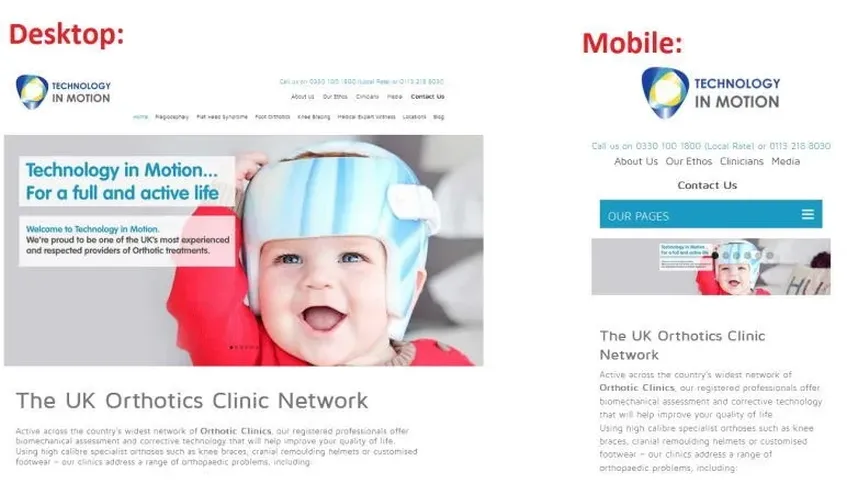
To better guide mobile users, Google is now placing ‘Mobile Friendly’ badges on responsive and dedicated mobile websites, as in the example below. They have recently started sending messages to site owners recommending that they adopt a mobile-friendly theme before the changes come into effect next month.
You can test the smartphone compatibility of your website using Google’s Mobile Friendly Test. Please note that this is prone to glitches so if it doesn’t work straight away, you might wish to try again later. If you have Webmaster Tools set up for your website, you can use this to get a full list of mobile usability issues.
How to Create a Mobile Friendly Website
As I mentioned earlier, there are two ways to develop a mobile friendly website:
- Create a mobile-only website to run alongside your existing site. This must be consistent with your existing site in terms of design, branding, content and so on.
- Make your existing website responsive so that it’ll perform well on all devices. If your site uses a template from a third party e.g. WordPress, you may be able to do this yourself. The process of making custom themes mobile friendly is rather more complex, and may well require the help of a developer.
Option 2 is generally the better one to go for as you’ll only have one website to deal with, making it far easier to manage and keep up to date. If your site could do with a complete refresh, it would therefore make sense to commission a brand new website with a responsive design.
Mobile Friendly Website Design and Content
Like all good desktop-configured websites, a mobile-only or responsive website should follow Google’s Webmaster Guidelines. These cover all the main factors of SEO, which help Google find, index and rank your site, such as ease of navigation, loading speed and quality of content.
You should ensure that your website is connected to web analytics (e.g. Google Analytics) so that you can monitor its performance and make any changes as required. It’s also important to check out your website’s mobile experience manually from time to time in order that any glaring oversights can be picked up and rectified.
In addition to the mobile compatibility update, you may have also noticed that you can now open installed apps directly from the mobile search results pages. Information from indexed smartphone apps has recently become a ranking signal for signed-in users, so if you have an app you should ensure that this is properly indexed. Ask your developer or check out Google’s guide to app indexing for more information.
How Zelst Can Help You with Mobile Optimisation
If you’re one of our clients, you will already be well aware of the importance of making your website mobile-friendly. Those who are ready to take the next step should contact us for further advice on creating a responsive website or optimising an existing template for mobile and tablet. Or head to our blog to learn how accurate mobile conversions are.